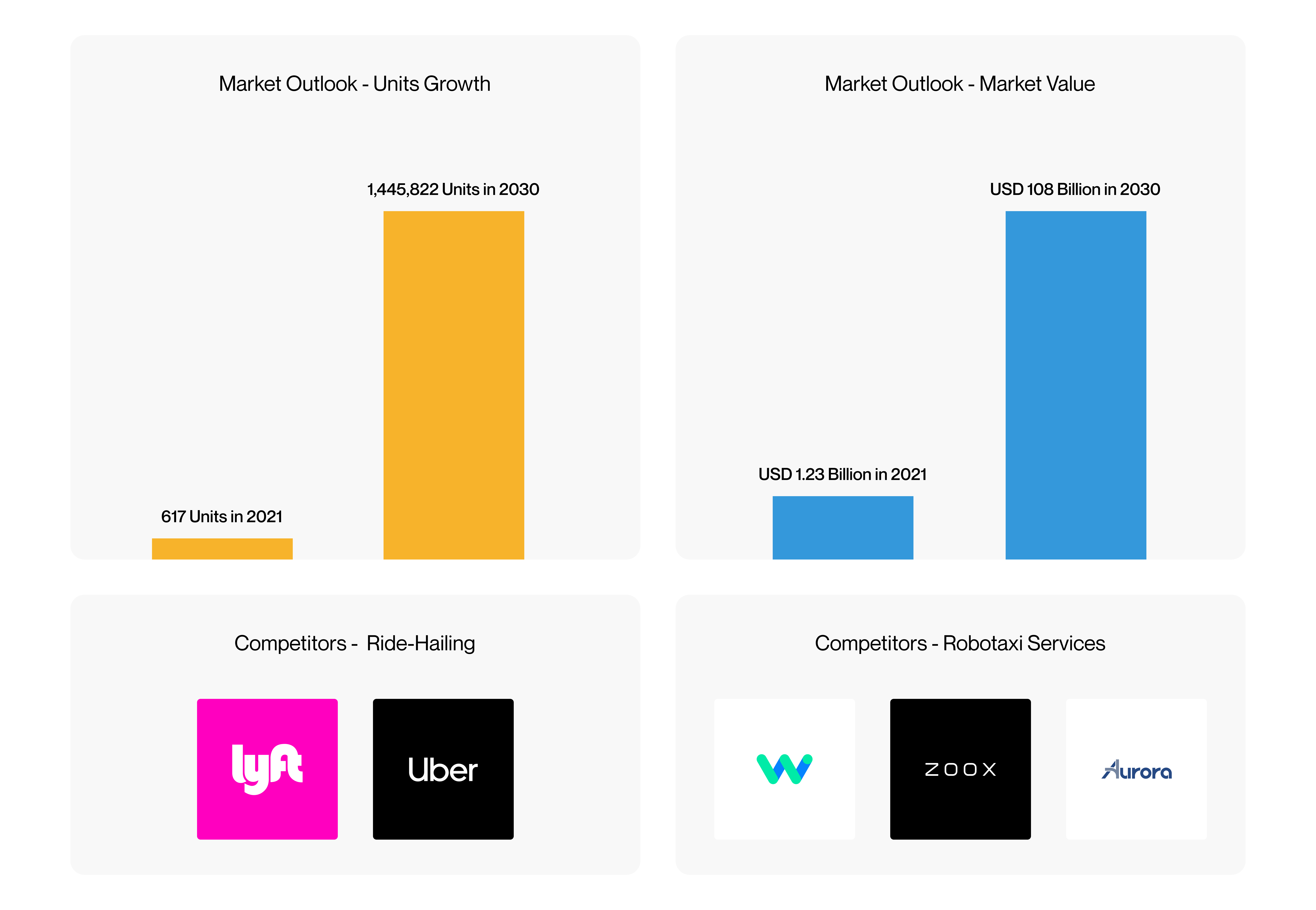
According to MarketsandMarkets, the global robotaxi market is projected to grow from 617 units in 2021 to over 1.4 million units by 2030. Fortune Business Insights also estimates the market value will jump from USD 1.23 billion to USD 108 billion over the same period.
This creates a strong opportunity to enter a growing space — but also means competing with established players like Aurora, Waymo, and Zoox, along with traditional ride-hailing services such as Uber and Lyft.
Despite strong market growth, many people remain skeptical of self-driving cars.
A Pew Research study highlights that Americans think driverless cars should meet much stricter testing standards than regular vehicles — among other concerns.

Additionally, these results come from a survey by the Boston Consulting Group and World Economic Forum on consumer concerns about self-driving cars.

A survey by Morning Consult highlights how public trust in self-driving cars dropped sharply after a self-driving Uber struck and killed a pedestrian in Arizona on March 18, 2018 — the first known case of its kind. The data shows a clear shift in perceptions before and after the accident.

Most consumer concerns — like feeling unsafe or wanting more control — come from psychological factors, while issues such as trust in mixed traffic and cybersecurity are more technical. This project focuses on improving the psychological experience for passengers in robotaxis.
Building trust between the car and the passenger starts with focusing on the passenger experience and creating a positive first impression.
According to a research paper by TU/e, we can strengthen user trust in autonomous vehicles by designing an intelligent system that mimics human behavior through factors like these:

The study found that adding speech on top of a GUI made the system feel more trustworthy to users than a traditional GUI alone.
Introducing Athena AI. Going beyond a traditional GUI, users can also interact with Athena through natural language, making it a conversational UI. Studies by the University of Nottingham (source) and TU Delft (source) show that CUIs are often perceived as more trustworthy and give users a stronger sense of control—whether in autonomous vehicles or decision-support systems.
Naturally, Athena also includes a GUI for greater flexibility and accessibility, accommodating users who might be socially introverted or have speech or hearing impairments.
We are anthropomorphizing Athena so passengers perceive that she has some degree of rational thought and conscious feeling, as discussed in this study by the University of Nottingham. This makes passengers feel safer and more comfortable during their ride.
My initial concept was to design Athena as a humanoid character, animating her facial expressions and displaying her on the touch interface.
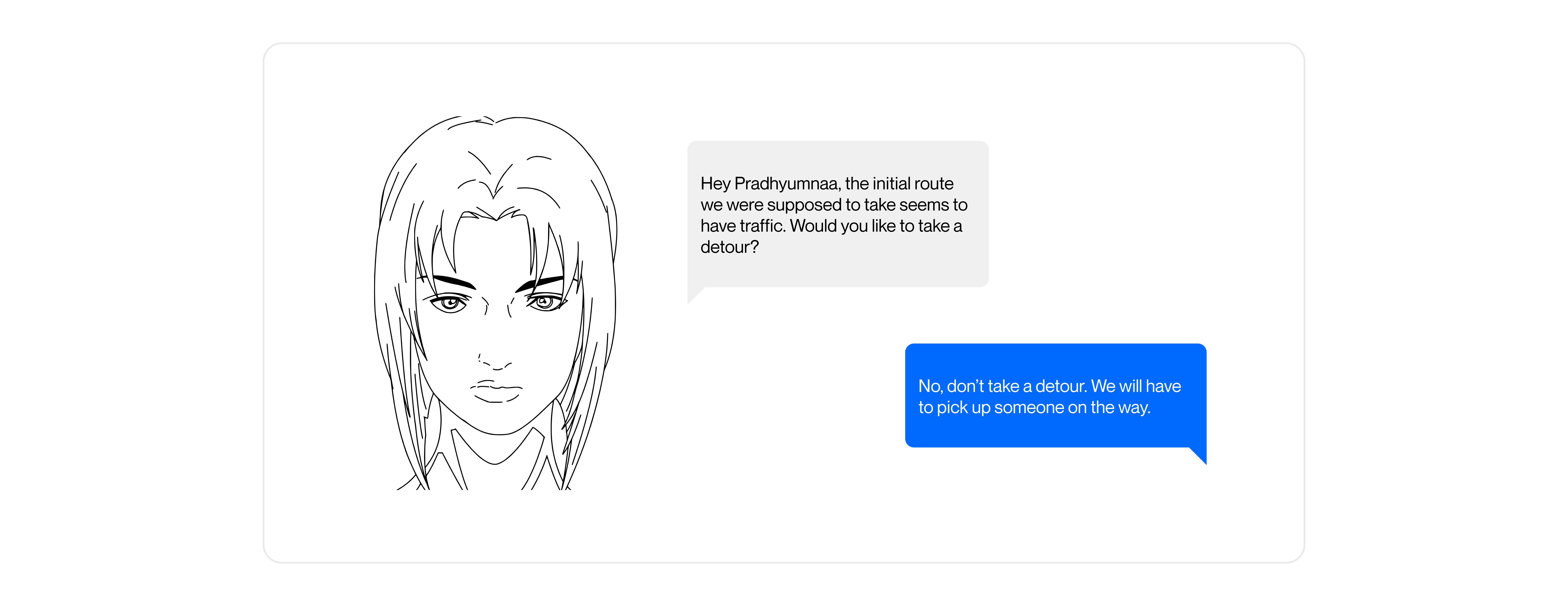
But this felt too static for Athena. She shouldn't just be something confined to a screen. I also wanted to keep the Uncanny Valley in mind when designing her. This led me to reconsider creating Athena as a humanoid agent and look for a different approach.
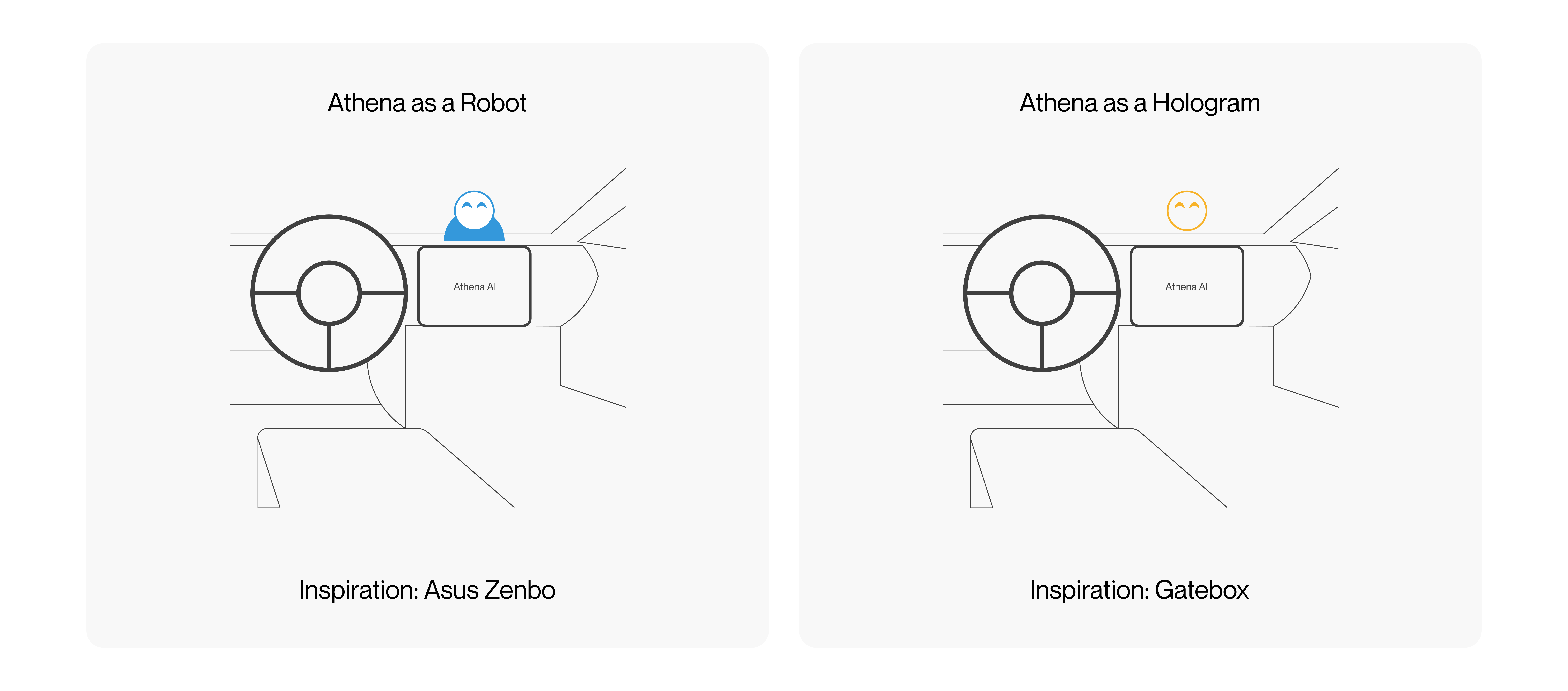
After researching implementations of anthropomorphism, I arrived at two possible directions for designing Athena:
In practice, Athena's conversational system could be applied in a wide variety of contexts. Below is a table highlighting some potential conversations Athena might have with passengers during a ride. This is not meant to be an exhaustive list.

Based on these scenarios, I created a voice prototype to demonstrate how Athena might interact in practice. This prototype was built using VoiceFlow.

A potential implementation for the conversational system involves using an intent recognition model. This ensures that passenger inputs are accurately understood and appropriately handled, forming the backbone of an effective dialogue system.
To simulate how such a model could perform in a Robotaxi context, I used the Banking77 dataset as a proxy.

The model achieved accuracy levels comparable to existing research, such as in the paper "Natural language understanding for argumentative dialogue systems", which reports accuracies between 86.2% and 93.9%.

There are several ways to authorize a ride, each with trade-offs in security, convenience, and complexity. Some methods, like keypads or QR codes, could let unauthorized individuals enter the car before verification — increasing the risk of misuse.

For this project, I've chosen the mobile phone approach using Bluetooth Low Energy. This ensures the vehicle remains locked to anyone else, unlocking only when the authorized passenger is nearby with their phone, balancing security, user experience, and system simplicity.
Before starting the wireframes, I wanted to visualize the end-to-end experience of a user booking and riding in a Robotaxi through the app by creating a Customer Journey Map. This helps me understand the complete user flow, make more informed design decisions, and identify potential pain points.
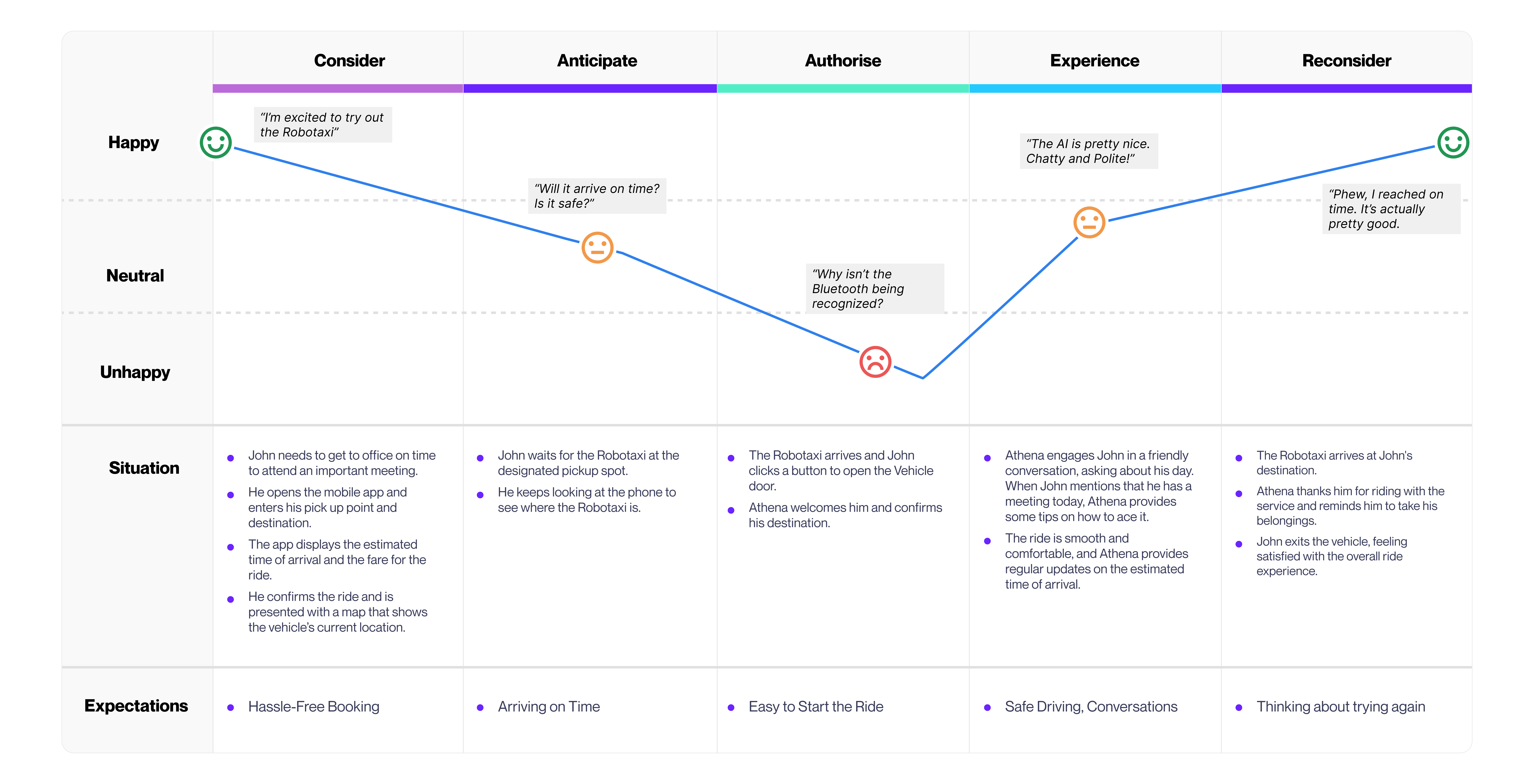
The "Authorise" step stands out as a possible source of friction, especially if Bluetooth connectivity issues arise. If this becomes a common problem, we may need to introduce secondary authentication methods like facial recognition, QR codes, or OTPs. On the other hand, the "Experience" phase is designed to delight — for many, the novelty of riding in a driverless car and conversing with an intelligent system like it were human is inherently exciting.
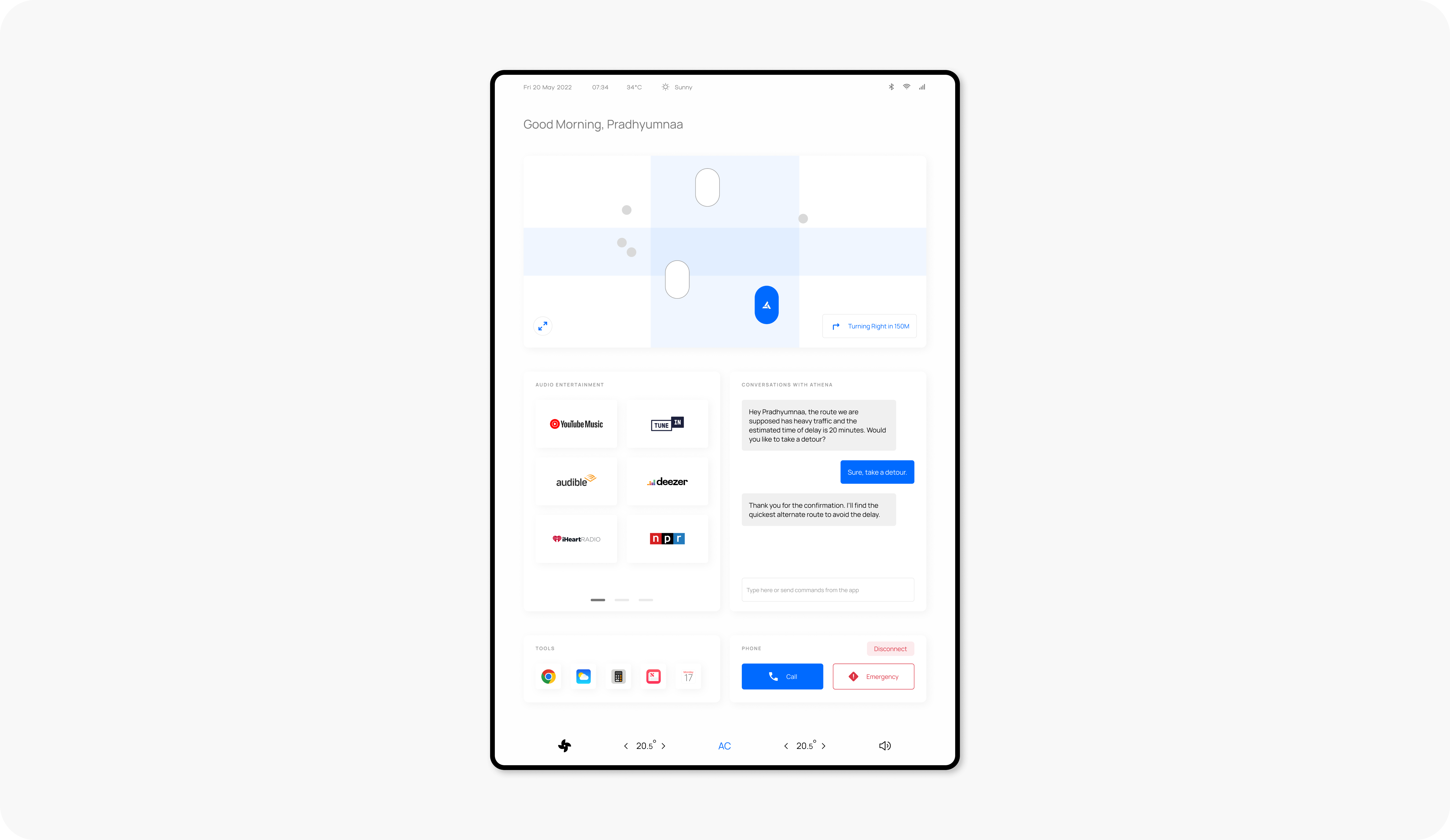
To begin designing the In-Vehicle UI, I first identified the essential features such a system should include. This study by Capgemini provided valuable insights into what consumers expect from self-driving cars. Based on these findings, I developed an information architecture outlining all the functionalities of the in-vehicle interface.

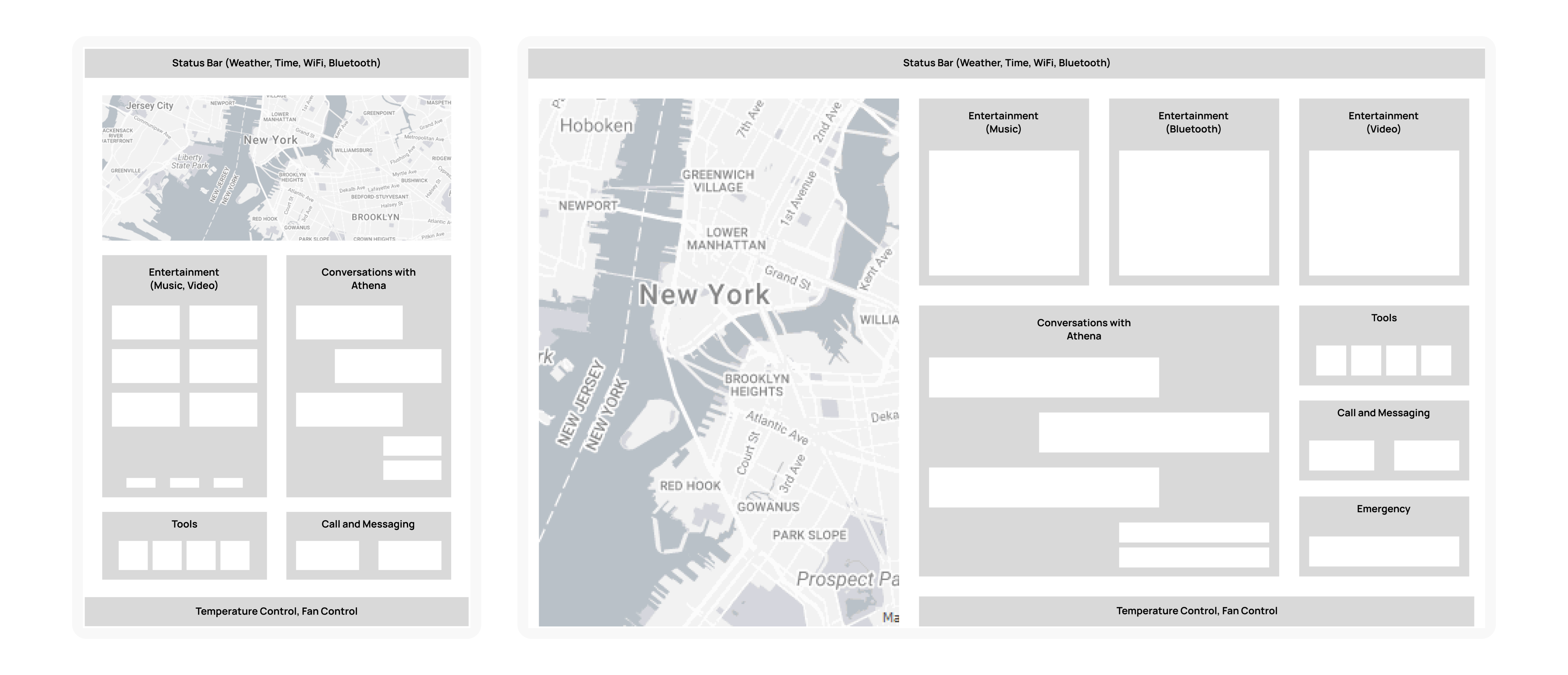
Using this structure, I created two wireframe variations: one with a vertical orientation and another with a horizontal layout. I chose to proceed with the vertical design, as it is better suited for browsing certain types of content, like news articles, and aligns with the broader shift from desktop to mobile content consumption. To enhance versatility, the screen can also rotate to a horizontal view for activities such as watching videos, mirroring the familiar behavior of smartphones—vertical for most tasks, horizontal for immersive media.
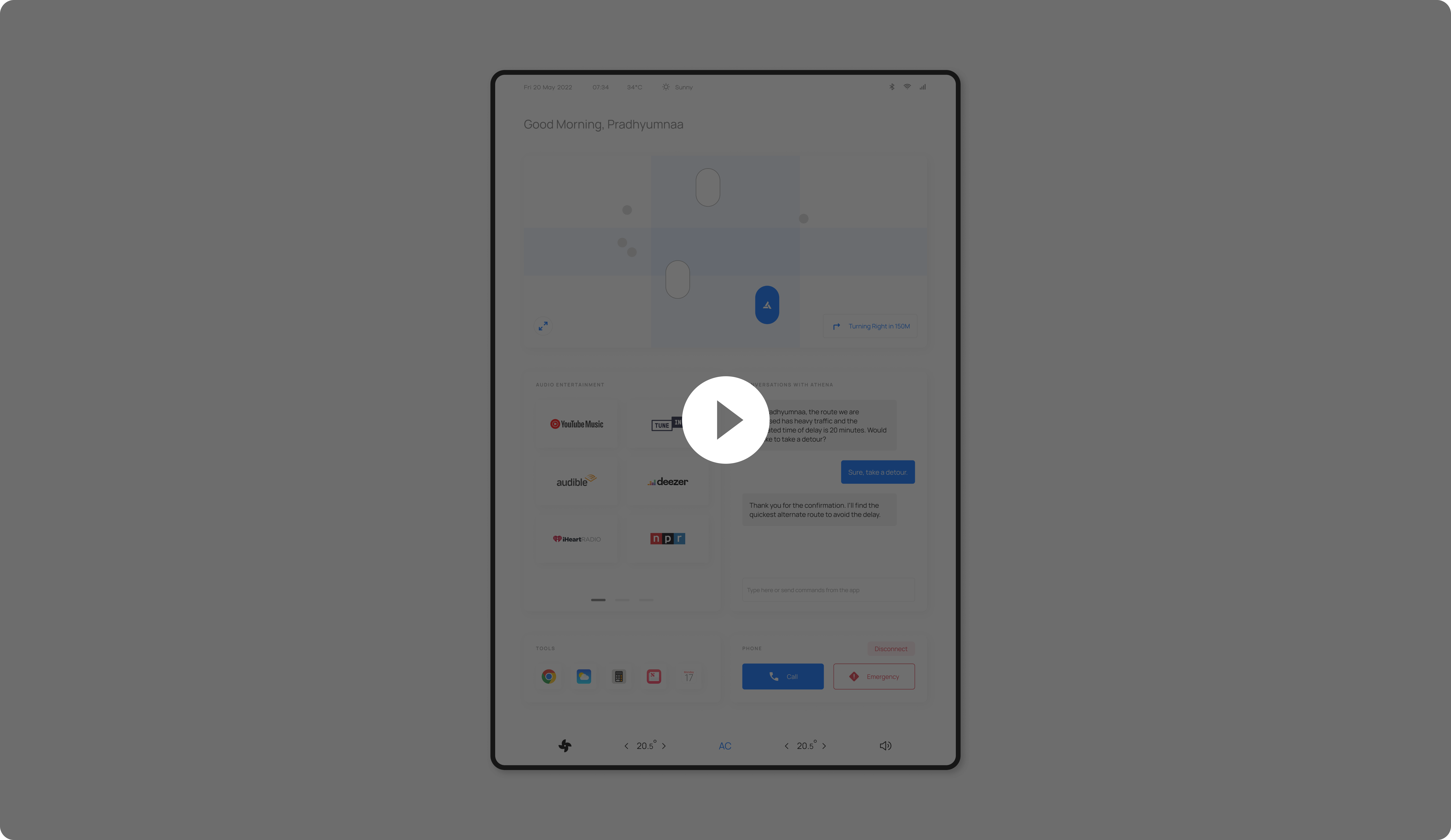
This high-fidelity prototype captures the complete design vision for the In-Vehicle UI, showcasing the layout, visual hierarchy, and user flows. While not all elements are functional in this prototype, it effectively illustrates how the final experience would look and guide users through their interactions inside the vehicle.
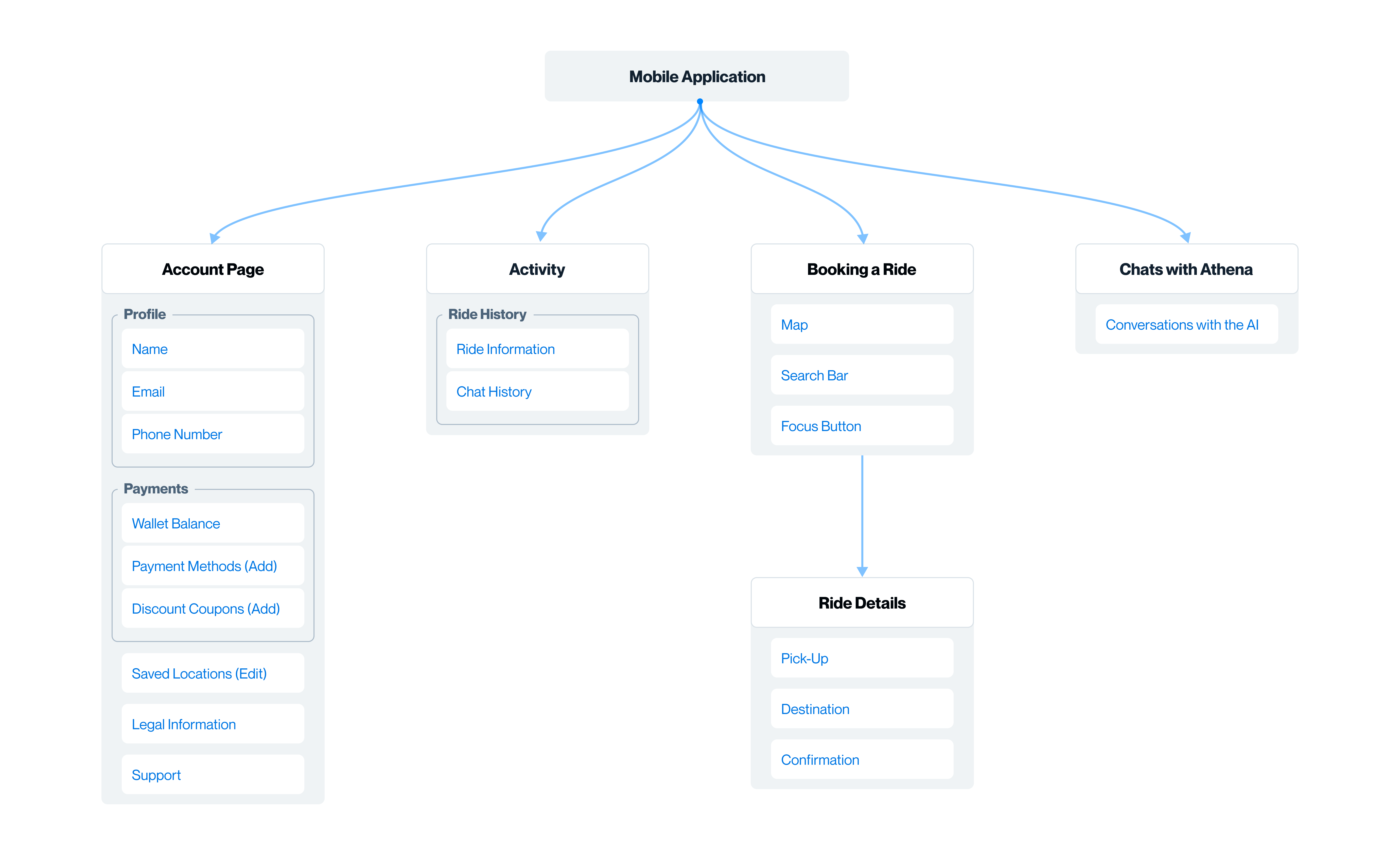
To begin designing the mobile application, I mapped out an information architecture inspired by established ride-hailing platforms like Uber and Lyft. This provided a familiar foundation while tailoring it to the specific needs of the Robotaxi experience.
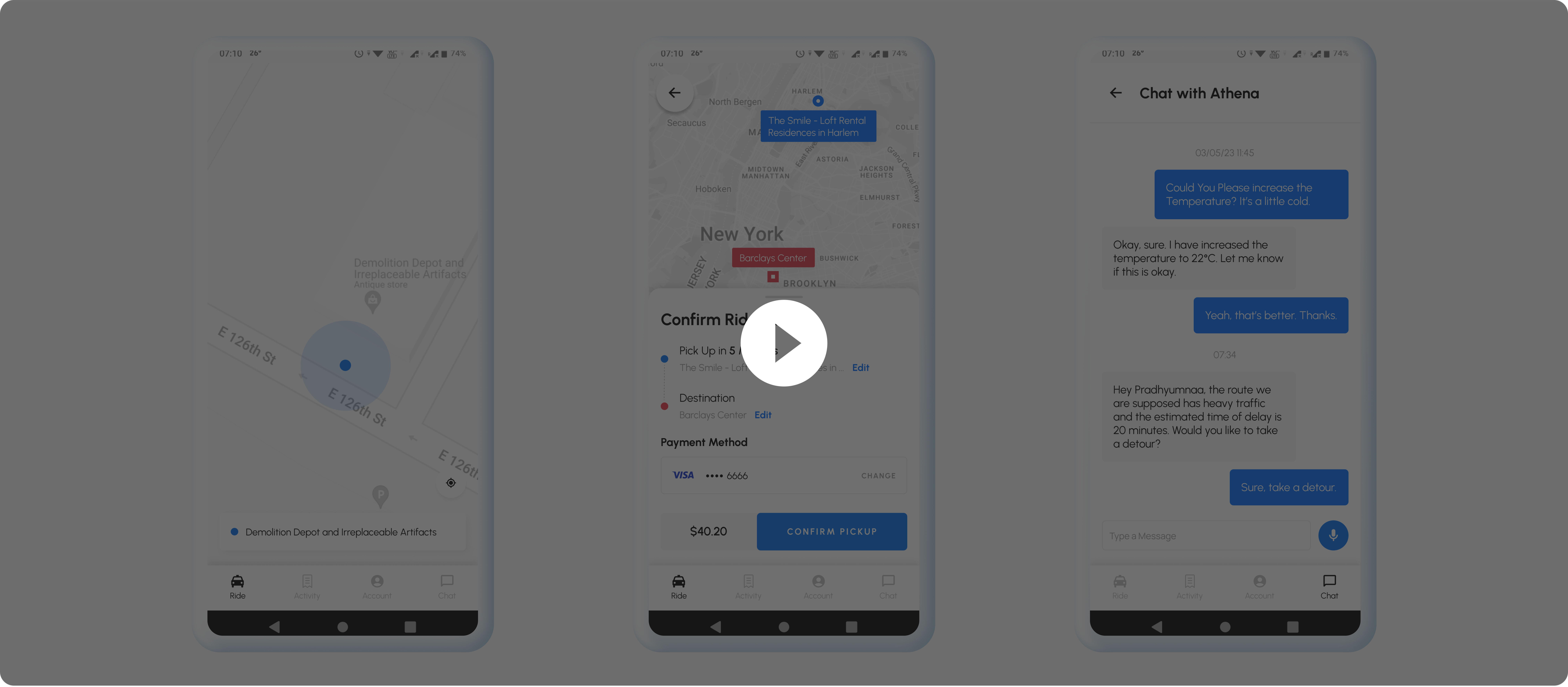
I started by sketching initial wireframes to explore different layouts and flows. Once I finalized a direction, I translated these into a high-fidelity prototype of the mobile app. The core user flow covers adding a payment method, selecting a pickup point and destination, confirming the ride, enjoying the journey, and completing the payment. The overall design draws heavily from familiar ride-hailing patterns to ensure users immediately understand how to navigate the app.
I evaluated the In-Vehicle UI by conducting a System Usability Scale (SUS) test with 13 participants. The UI received an average SUS score of 82.5, which is well above the benchmark of 68 for an above-average product, according to Usability.gov. Alongside the scores, a few participants also shared written remarks within the SUS questionnaire, highlighting that the interface felt intuitive, modern, and versatile — while also offering small suggestions for visual improvements.

77.5[User 3]: Seems simple enough to use and understand, gives clear instructions, versatile and provides a lot of things like music and stuff. I think thats everything I need.
90[User 6]: It's pretty good for a prototype.
72.5[User 7]: The UI looks intuitive and very functional. Although the design could look more friendly to the user, it is good in the way that it looks modern.
Athena is still very much a work in progress and will evolve through user feedback and iteration to meet changing needs.
A few key considerations going forward:
Building a robust intent recognition model will require a dataset tailored to Athena’s conversational goals and more advanced techniques, instead of general proxies like Banking77.
Beyond Athena's interactions, the underlying autonomous driving and decision-making system must be thoroughly engineered to ensure passenger and pedestrian safety. Assuming a well-developed ADAS foundation, Athena can then become the core differentiator that sets this service apart by focusing on the passenger experience.
It's also wise to launch in a single city first, ideally in a market that's more open to autonomous vehicles. This allows close monitoring of user adoption and feedback, with opportunities to fine-tune before scaling to new regions.
If you'd like to discuss this project further or explore future collaborations, feel free to reach out at pradhyumnaag30@gmail.com.
https://www.fortunebusinessinsights.com/robo-taxi-market-103661
https://www.mdpi.com/2414-4088/2/4/62
https://dl.acm.org/doi/abs/10.1145/3342197.3344545
https://pure.tudelft.nl/ws/portalfiles/portal/120916815/3485447.3512248.pdf
https://en.wikipedia.org/wiki/Uncanny_valley
https://www.gatebox.ai/gatebox
https://www.capgemini.com/wp-content/uploads/2019/05/30min-%E2%80%93-Report-1-1.pdf